Moana EV — Car Sharing Platform APP
Designed information architecture, user flows, wireframes, and high-fidelity UI for an electric vehicle sharing app and its monitoring management website from the ground up.
I. Summary
As the lead product designer, I engineered a seamless journey for a next-generation EV sharing service. By unifying the mobile reservation flow with a distraction-free in-car interface, we simplified the complex "locate-unlock-drive" cycle into a zero-friction experience.
Quick Facts:
Role: Lead Product Design Architect
Platform: Mobile App (iOS/Android) & In-Car HMI (Human Machine Interface)
Key Outcomes: 50% faster vehicle pickup time, significantly reduced driver distraction metrics, unified cross-device design system.
Key Skills: Automotive HMI Design, Cognitive Load Reduction, O2O Service Design.
II. Context & Challenge
The Context:
As EV popularity rises, sharing platforms face high churn during the transition from digital app to physical vehicle. We needed to solve for "Range Anxiety" and the dangerous complexity of legacy car-sharing HMI systems.
The Problem:
O2O Fragmentation: The mental model of finding a car on a map didn't translate well when the user stood next to the physical vehicle. High operation complexity in outdoor environments caused user stress.
Driver Safety Risks: Legacy car dashboards were cluttered with non-essential info, causing dangerous distractions during short-term rentals.
The Goals:
Frictionless Transition: Shorten the time from "Booking Confirmed" to "Engine Start" via guided offline instructions.
Safety-First HMI: Design a radically simplified in-car interface that prioritizes only driving-critical data.
Universal Consistency: Extend the Design System to hardware viewports to eliminate cognitive load during device switching.
III. Design Process
Design Methodology & Strategic Rationale
A. Cross-Platform Journey Mapping
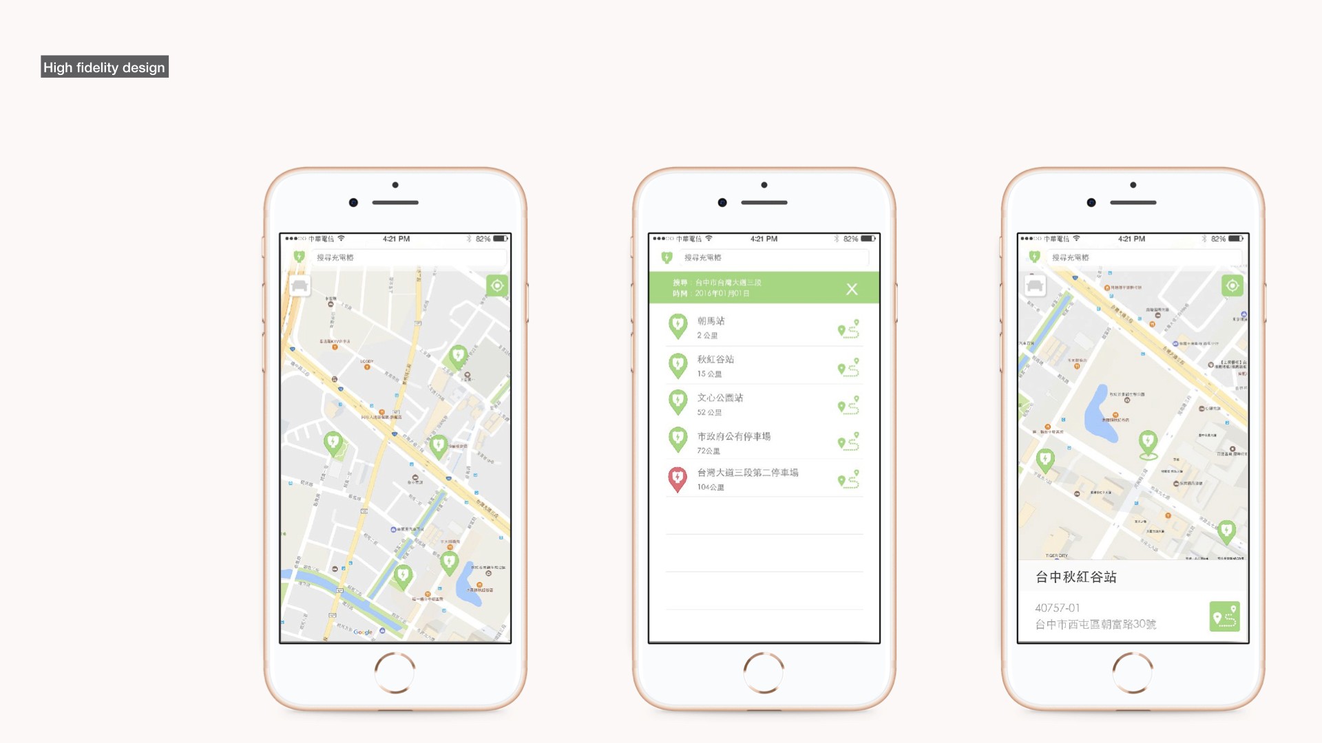
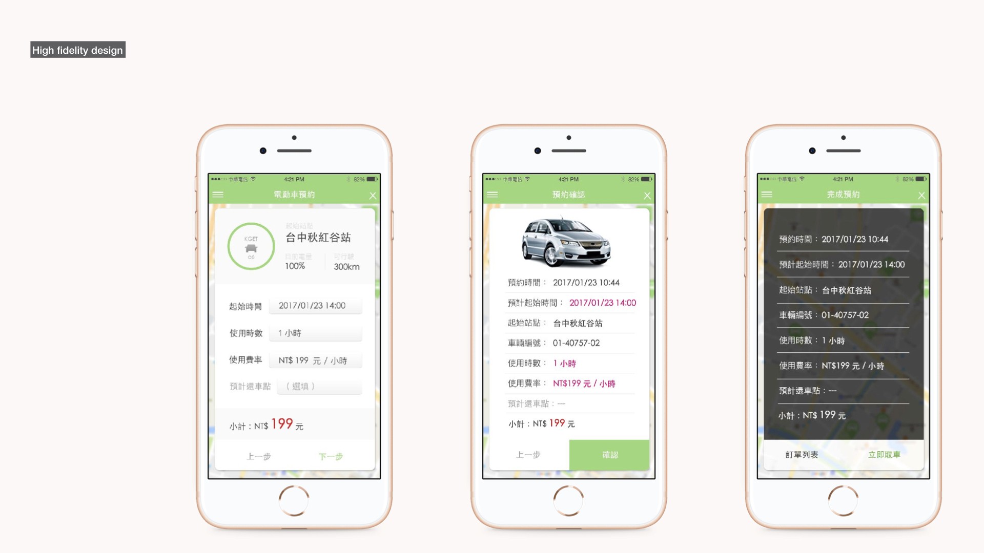
O2O Synthesis: I mapped the complete flow from app-based reservation to physical ignition.
Strategy: Focused on the "Outdoor Hand-off" phase where users switch from phone view to car-door view. By implementing high-contrast visual cues and precise haptics, we reduced user hesitation during vehicle handover.
B. Solving Range Anxiety via Data UI
Dynamic Visualization: Instead of a simple percentage, I designed a "Safe Zone" radius on the map.
Logic: Users see exactly which destinations are reachable on the current charge, removing the mental math previously required to evaluate vehicle suitability.
C. Safety-Centric HMI Design
Cognitive-Optimized HMI Strategy: Applied strict data reduction principles to the in-car hardware viewport. Stripped the vehicle interface down to critical operational telemetry—Navigation, Velocity, and Range—to drastically lower cognitive load and eliminate driver distraction during the critical initial usage phase.
D. Systemic Consistency
Design Tokens: Extended the mobile UI kit into the vehicle's high-resolution HMI screen.
Value: This ensured that the colors representing "Battery Low" or "Locked" were identical across all hardware, building a consistent subconscious language for the user.